A distinctive visual identity for personalised nutrition
SEQNCE combines biological data with personalised supplements. I developed the creative concept, visual identity and packaging system, translating its scientific approach into clear, recognisable brand communication.

Challenges
The challenge was to communicate scientific precision while making personalised nutrition feel approachable and credible. The brand needed a distinctive visual identity that could work consistently across supplement packaging, testing kits and supporting materials.
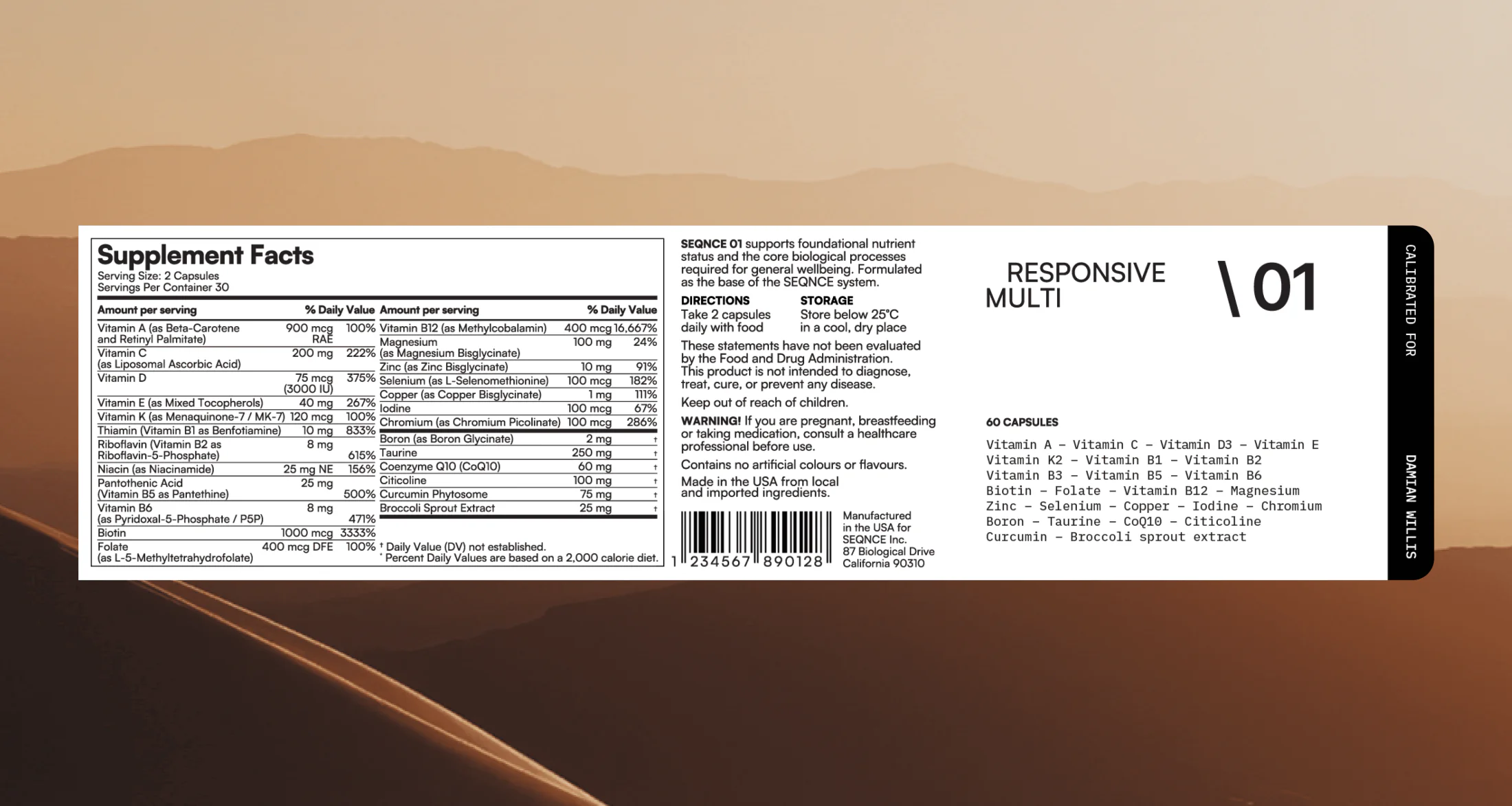
The packaging also had to accommodate different formulations and personalised information. Clear hierarchy and flexible layouts were essential to keep each product identifiable while maintaining a coherent brand.
Solutions
I built the identity around biological decoding, translating the idea into a geometric logo and a flexible graphic language. Consistent typography, restrained layouts and repeatable visual elements connected the brand across applications.
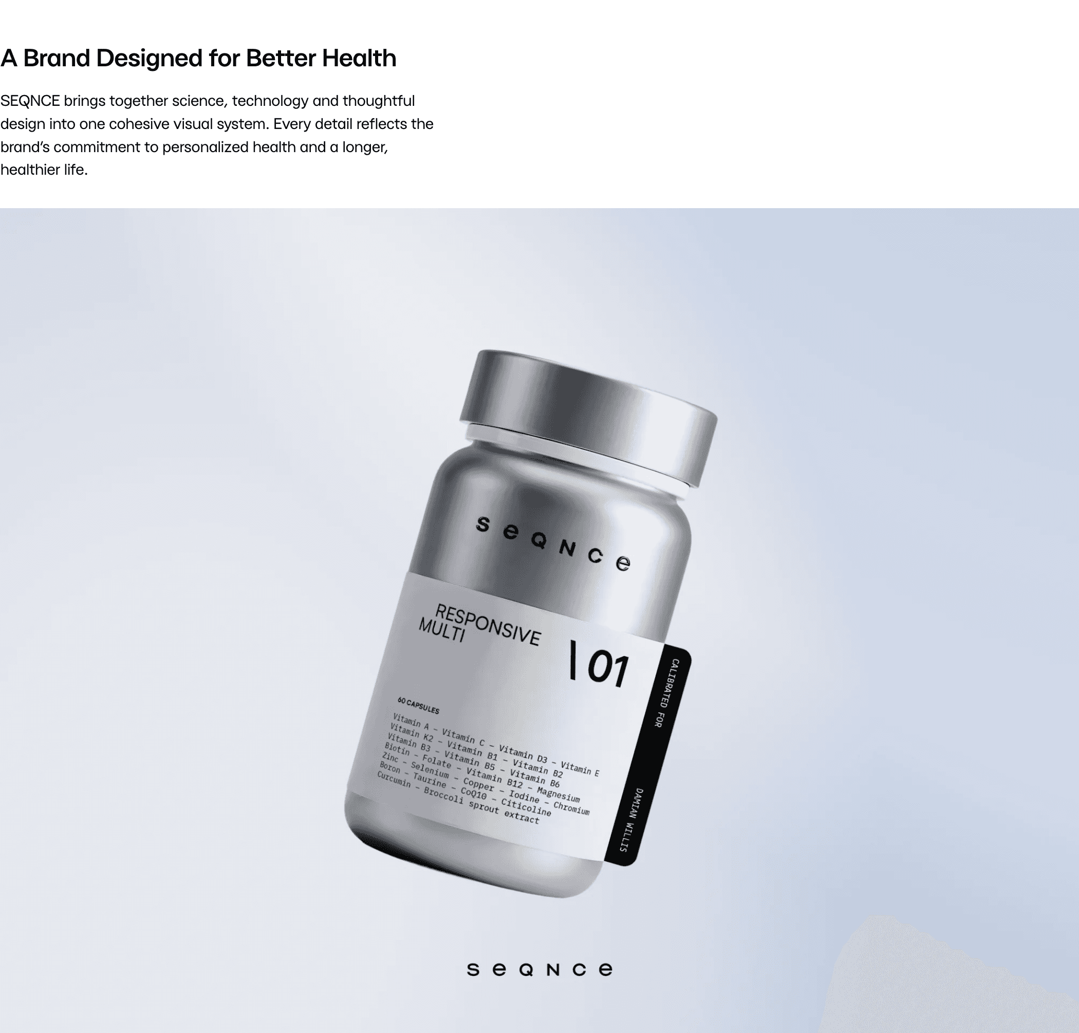
I designed a modular packaging system that separates fixed brand elements from product names, numbering and personalised information. I carried the same principles through testing kits and supporting materials, adapting each layout to its content and format while preserving brand recognition.